3 Steps to Create Content That Turns Readers into Subscribers Like Clockwork written by Guest Post read more at Duct Tape Marketing
Subscribers are a goldmine of marketing potential.
They share your content, heed your advice, buy your products, and tell their friends. They are easier to upsell, more profitable, and more loyal.
They return again and again, not because they have to, but because they want to.
Sadly, knowing the value of subscribers isn’t going to help you get more of them.
Which is why you’re here.
So how do you start mining for gold?
Start with email to collect subscribers.
In the world of subscription, emails rule.
If you build an audience on Facebook, Youtube, LinkedIn, or Medium, your success is at the mercy of the platform you’re using. And I don’t need to show you another example of a self-made celebrity who upset their digital place of business at the cost of their career.
With email, though, the audience is yours. No one can tell you what to send, say, offer, or do. And that’s a nice dose of freedom for a growing business.
But email isn’t just the safer option. It’s also an effective place to build a subscriber base.
A study of 605 businesses done by HubSpot, the massive marketing company, found that businesses that collected subscribers by email had 12 times more subscribers than those that used RSS feeds.
To start collecting emails, you’ll need approachable content that you consistently promote to new audiences. And you’ll need to add a dose of incentive.
Here’s that three-step process.
Make your content approachable
The first step to gaining subscribers is creating approachable content.
Content that attracts your ideal customer, delights them once they click, and encourages them to enter their email address in that glorified empty text box.
But creating content that is approachable is a lot easier said than done.
After all, what makes content approachable? Is it the way you talk? The way you write? The way you design?
Well, it’s a little of all three.
First, let’s take a look at the design of your website. When people arrive on your website to view your content, what is their immediate reaction? Is it one of neutrality, enjoyment, or outright horror?
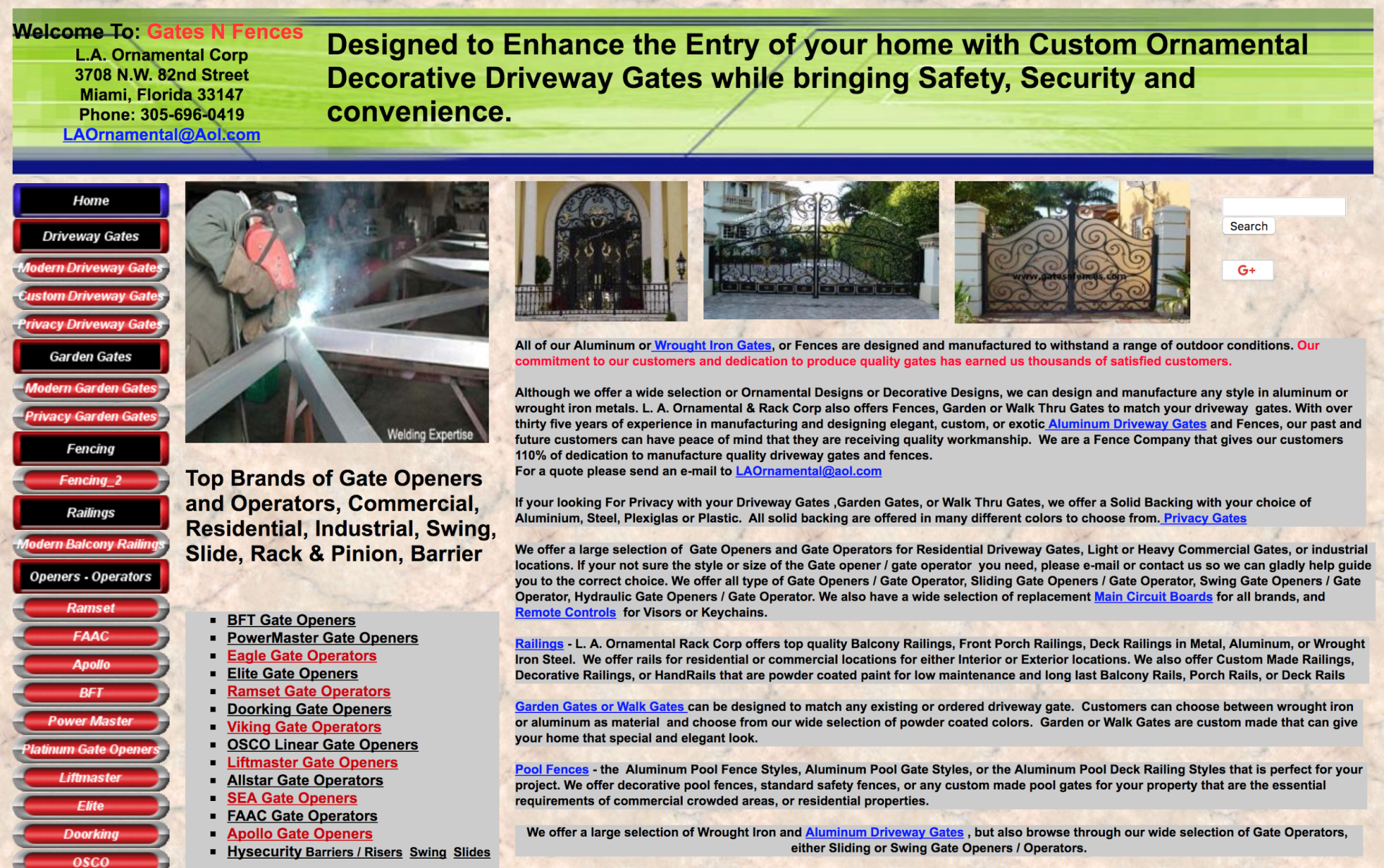
Imagine, for instance, that you arrived on this website: Gates N Fences.
I don’t know about you, but I’d leave the moment I arrived.
Which means that I wouldn’t read any of the actual content, and I definitely wouldn’t subscribe.
With a design like that, practically no one would.
That’s exactly why you need a website that communicates expertise, confidence, simplicity, and above all, trustworthiness.
And you can do that on a low budget. Just keep your website design simple and include plenty of whitespace. When in doubt, don’t add any extra elements.
Booktrep, for instance, is a low-budget WordPress website that is simple, elegant, and, for those reasons, trustworthy.
Of course, the bigger your design budget, the more intricate your website can be. Just ensure that you don’t overdo it like the good ‘ole Gates N Fences example from above.
Consider something like the BigCommerce blog where its intricate design doesn’t confuse navigation, crowd content, or provoke distrust.
The last thing you want to do is spend hours upon hours creating quality content, only to drive traffic to your website that sows distrust among visitors.
The whole point of creating content is to generate subscribers who will turn into customers in the future.
If you place the unnecessary roadblock of a poorly-designed website or lazy navigation between you and that audience, then your subscriber base, customer base, and thus, revenue, will suffer.
Riffing on that same note, you also need to consider the load time of your website. The longer your site takes to load, the fewer people who will stick around to see what you have to offer.
But a fast website means more visitors, which means more subscribers.
Unfortunately, too many large image files, locally-hosted video content, or HTML and CSS discrepancies can kill your website’s load speed faster than you can say, “But wait! There’s more!”
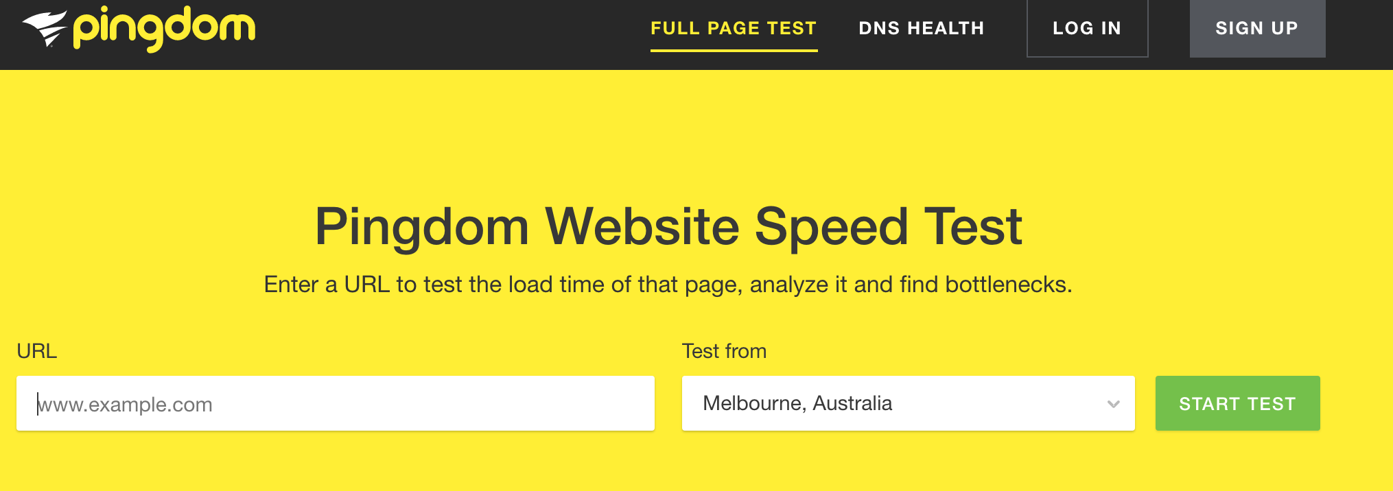
To check how fast your website is, you can visit Pingdom.
But it’s not just the design or speed of your website that determines whether or not your content is approachable. It’s also the content itself.
Research from Medium, the massive online public blog, found that the ideal blog post takes 7 minutes to read and sports about 1,600 words.
That might sound like a long blog post. But notice how the four-minute marker on that graph doesn’t show much decline?
The real punishment arrives when the reading time is three minutes or less. In other words, you can probably get away with 800 to 900-word articles and reap many of the same benefits.
When it comes to video content, that rule doesn’t apply.
In fact, with video, shorter is better across the board.
You have 10 seconds to grab the attention of a viewer. 33% of people will leave after 30 seconds, 45% will leave by one minute, and 60% will leave by two minutes.
This means that you should structure your video content a bit like a journalist. Start with the most important, intriguing, visceral information, and then gradually include less critical information as the clock ticks.
For pacing within a blog post, consider sprinkling images throughout the piece like I’ve done thus far. This gives the reader a break between blocks of text and makes the article easier to read.
Finally, you can practice empathy within your blog posts to create approachable content.
Be empathetic to the visitor’s concerns, experiences, and current understanding of the world.
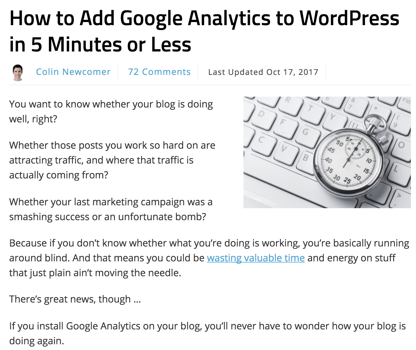
Consider how Colin Newcomer starts his blog post on the massive online blog, Smart Blogger.
Here’s what Colin does so effectively.
- He recognizes the problem that his reader is facing.
- He agitates that problem to show him how well he understands their pain.
- And he offers a solution.
And that formula makes for an article that readers feel understands them, is trustworthy, and offers valuable information.
A clean web design, fast load time, and optimized content length have a similar effect on visitors.
Which means that people will be more likely to give you their email address.
Promote your content to new audiences
If you’re not reaching new people, you can’t gain more subscribers.
So once you’ve created that share-worthy content, it’s time to show that content to new audiences.
One of the benefits of publishing content on your own blog is that you still reserve all of the rights to that content — with other publications, that might not be the case. This means that you can reuse the content whenever and however you like.
For instance, you can republish the piece on Medium, Quora, and LinkedIn. Which can be a wildly effective way to gain email subscribers. Daniel Ndukwu writes about how he increased subscriber base by 339% in 60 days using Medium and Quora.
This strategy doesn’t take any extra time, and it gets your content in front of a brand new audience.
It’s a no-brainer marketing strategy that should become part of your regular publishing routine.
Another no-brainer strategy you should use is Social Media sharing. Every time you post a new piece of content, share it on Facebook, LinkedIn, and Twitter with a link to your website.
But here’s the part that might not be such a “no-brainer.”
Tag any friends you think might be interested in the piece of content. Sort of like Shopify content marketer Aaron Orendorff does with his Facebook posts.
Why?
Because doing so won’t just encourage the people you tagged to look at the article. It will encourage all of their friends to look at the article as well.
You see, when you tag someone in a post on LinkedIn or Facebook, that post will show up to all of the friends of the people you tagged. That’s a massive audience increase by just typing the “@” symbol.
By using social media tags, Medium, Quora, and LinkedIn to get your content in front of new audiences, you’ll build a subscriber base in no time.
Create a lead magnet
Some visitors will be more difficult to turn into subscribers. They’ll require more… incentive.
And the best way to create incentive is by creating a lead magnet. Basically, an exclusive piece of content that you only give to those who opt in to your email list.
Aaron Orendorff does this on his website, iconiContent.
This is what his homepage looks like.
Then, if you scroll a ways down the page, this will pop up on the side.
Lastly, if you scroll through one of his blog posts, this scroll-depth-triggered overlay will appear near the end.
To create your own lead magnet, ask yourself these questions.
- Who is my target audience?
- What is their biggest struggle?
- What kind of content could I create to solve that problem?
Then, create the piece of content for your audience, turn it into a PDF, and make it a downloadable resource for those who opt in. Or, you can repurpose a piece of content you’ve already created and do the same thing.
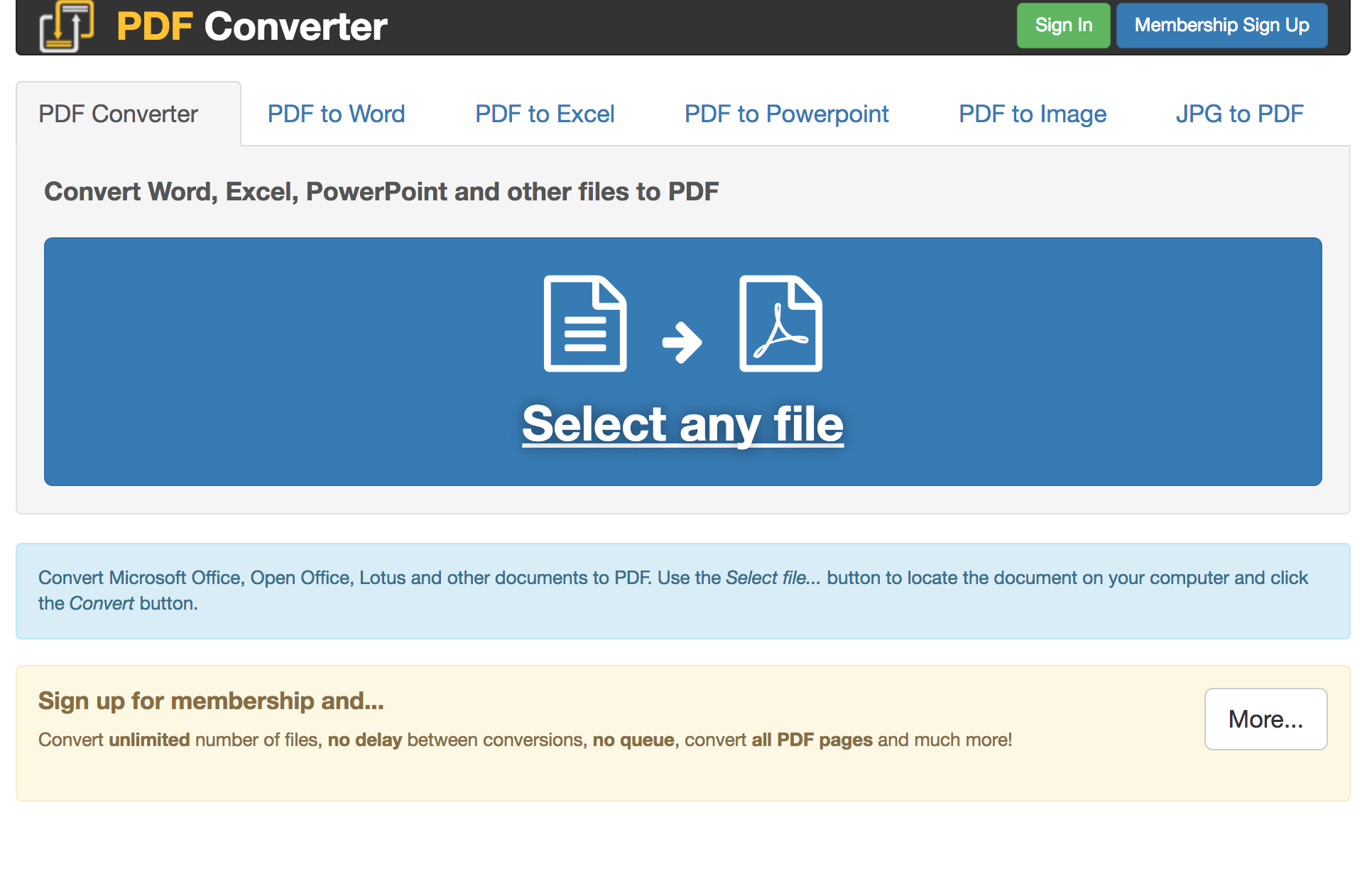
You can use PDF Converter to turn an old blog post into a lead magnet for free.
Conclusion
You know the potential of subscribers.
You know that they represent a goldmine of selling and upselling potential – that they’ll tell their kids, spouse, friends, and coworkers about your business.
That they are loyal, profitable, and revenue-driving.
But you also know that they aren’t automatic.
Building a loyal audience takes work. Specifically, you should focus your efforts on email-subscription, create approachable content, consistently promote that content to new audiences, and build a lead magnet for an additional incentive.
Only then will you dip your pan in the correct stream.
About the Author

Brad helps SaaS startups create actionable long-form content for a fraction of the price of a content writer. Give him a pug and a pencil and he’s off to the races!
Powered by WPeMatico


